Dark Mode UX Study: Facebook Messenger
Facebook Messenger falls into some common dark mode UX pitfalls, here's how to avoid them when designing.
Recently, the Facebook Messenger app added dark mode support. And although it went through months of beta-testing, it doesn't look like a lot of work went behind it. While this is disappointing, it does give us a good case study on how not to design your dark mode.
Why does this matter?
The importance of dark modes
Nothing makes me happier than apps offering dark modes. If your app is successful, you SHOULD be providing a dark mode, because:
- it's not a lot of work
- it can improve usability for thousands of people
Dark modes have become a serious accessibility concern in recent years. Unsurprisingly, the first company to make a major step towards improving dark mode was Apple. In MacOS 10.14, a global switch was added to force the OS to use dark mode.
Apple didn't stop there however. With this update, they also pushed support for prefers-color-scheme within Safari. This media query allows sites to check if the OS is using dark mode and display a dark theme accordingly.
Slowly but surely, more OS are now dropping their old and antiquated dark modes (which were really just changing the normal colour scheme to a 1:1 inverted palette) in favour of well thought out dark themes.
The Facebook Messenger Dark Mode
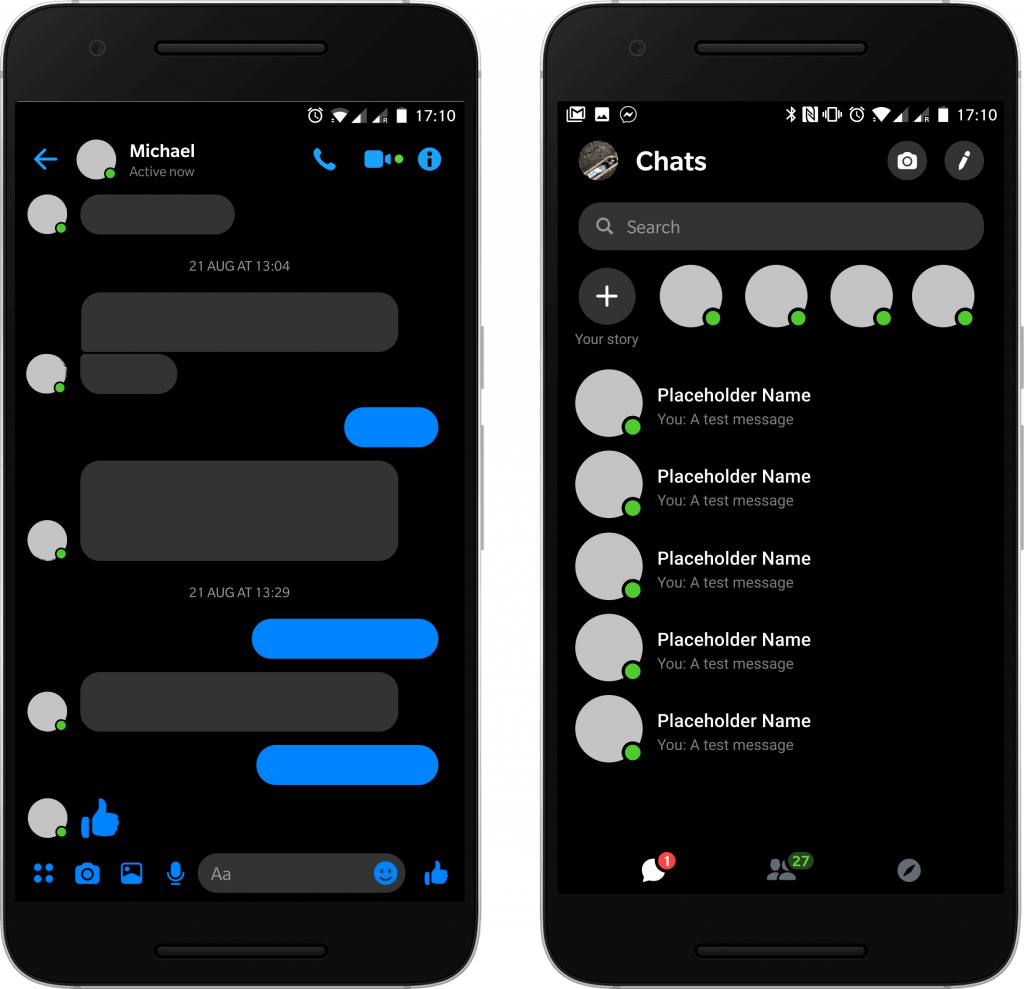
This is how the dark mode in Facebook Messenger looks. It's kind of... disappointing. If you take a good look, you'll realise that all they did was change the background from white to black and remove some containers. This results in a flat and lazy design with no depth.
Additionally, all text that was black has been inverted to a full white. This might improve contrast but will also definitely strain the eye. Gray text has stayed the same colour, making it actually harder to read as it blends into the background.
What annoys me the most however is the removal of the background from fixed elements like the top of the chat (containing the person's name and profile picture). The background from elements at the bottom (such as the chatbox and page icons) is also removed.
It's a very poor attempt and leaves me wondering: A) Why this take so long to make, and B) What the beta testing was for.
My redesign
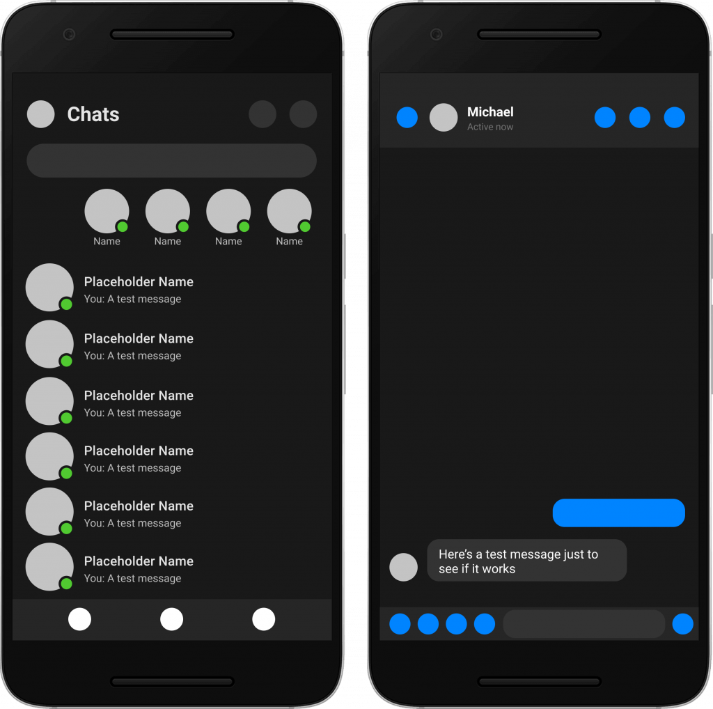
You can see I've made very minimal changes here, but if anything this speaks volumes about how little work was required to improve this interface.
Here's a few considerations that are key to this design.
- Fixed elements that don't move should have a clear separation from the rest of the page. This helps with hierarchy and visual flow.
- Never use
#000for backgrounds. - If you have no choice at least don't use
#FFFtext on#000backgrounds. - Consider different shades of grey for different depths - i.e. dark greys for backgrounds and lighter greys for elements on top.
- Instead of using
#FFFfor text, consider removing some lightness and going with the whitest grey possible instead.
With these few changes, the dark mode quickly goes from looking flat and rushed to looking like something that had some thought put into it.
In conclusion
Okay, so I'm not saying Facebook should scrap their design immediately in favour of mine. ...Unless? Let's just assume though that there are improvements coming soon, and give them the benefit of the doubt here.
If you, unlike Facebook's design team, have the time, there's no excuse not to spend some resources doing some dark mode UX research for your app, especially if it's something people will spend a lot of time reading from. Hard blacks and whites strain the eyes after all.
It would be hypocritical to end this article without promising that there'll be a dark mode for ironeko. This is absolutely something I intend to do. So if you're reading this after January 2020 and there's no dark mode option, feel free to leave an angry comment!