The Art of Engagement: Duolingo's Key to Success
Having proved steadfastly popular since its inception a decade ago, Duolingo shows no signs of slowing down. So how does it keep us hooked?
Duolingo's presence as the world's leading language-learning app is undeniable. In fact, according to their LinkedIn page, the app boasts 300 million users. That's not a number to be sniffed at.
If you've tried Duolingo (and if you're even a little into languages, you probably have) you'll have noticed just how easy it is. Once your account is set up, you're always only two clicks away from starting a lesson. (Or a scroll and two clicks depending on how far along the syllabus you are). But you get my meaning. The UX is smooth.
I'm using the word 'lesson' loosely, of course. The bite-size tests you complete to progress are essentially streak-based games: the longer your streak, the more points you gain at the end, giving you benefits like a higher place on the leaderboard or access to 'lingots' (which are essentially Duolingo currency).

As of 2019, all Duolingo app users are automatically placed in leagues (bronze, silver, gold, diamond, etc) at the start of each week, and progress through these by gaining XP
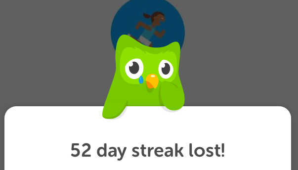
Users will even share screenshots of their impressively long streaks (sometimes hundreds of days long) on Facebook groups for language learners, and congratulate each other on their feats.
Clearly, a competitive element is at play here with regards to ensuring engagement. You can be competitive with other users, and also competitive with yourself. It's a recipe for success that other language apps are yet to crack.
But there's something else Duolingo does incredibly well. It nags you.
Duolingo pulls at your heartstrings with its cute mascot
How Duolingo Guides You To Return
Okay, so it's more like _persuadin_g. But Duolingo users will call it nagging, albeit with an affectionate smile. If you stop responding to the app's push notifications for example, you'll eventually receive one saying 'these notifications don't seem to be working' along with the promise that Duolingo will stop sending them for now. The tone is just considerate enough not to be annoying. It's very clever, really.
And Duolingo even works these persuasive tactics if you have been engaging. A day after playing, for example, you receive a notification saying something like:
'You've learned 7,400 words in Italian so far! Take another lesson today to learn more!'
Or something of that ilk. This is usually accompanied by a mini icon of Duolingo's owl mascot (the owl you see crying when you either failed a test or haven't played enough).
This notification functions to:
- Encourage the user to compete with themselves through reminding them of the benefits continuing to use the app
- Remind the user of what they could lose if they neglect their lessons
A Gentle Push
Push notifications have been around since 2009, and yet most apps haven't discovered how to use them in any sort of valuable way. People will have them turned on to be notified of sport scores or Instagram likes or Facebook messages, but Duolingo is the only hyper-popular app around right now which uses these to cultivate a relationship with its users and inspire motivation.
You can even set a designated 'reminder time' in Duolingo's settings to make sure you receive your daily motivation when it suits you. This is something a lot of apps could really benefit from doing, to prevent users from turning off push notifications entirely. You can also choose what you want to be reminded of - if it's just practice reminders, a 'Streak Saver', or info about your place on the leaderboard. And all of this is very simply and intuitively set out in a single settings menu.
Thus, Duolingo has not only fine-tuned the tone and purpose of it notifications but made them feel welcome in your life by making sure they happen on your terms.
So persuading people to interact with the app at all is something Duolingo has mastered. But once you're on the app, how does it use the art of good UX to make your engagement as easy and addictive as possible?
A Helping Hand
I've been using Duolingo since around 2015, mostly to keep up my French skills from school. And this year I've had a fair bit of success learning Italian with the app's help. Recently however, life got in the way (as it does) and I took a two week hiatus.
Upon returning to the app, I couldn't remember which lesson I'd been working on last. So, I was prepared to scroll down, down, down and find it.
But Duo had a trick up it's sleeve to make sure I didn't have to search or scroll at all. To my surprise, this appeared at the top of the page:
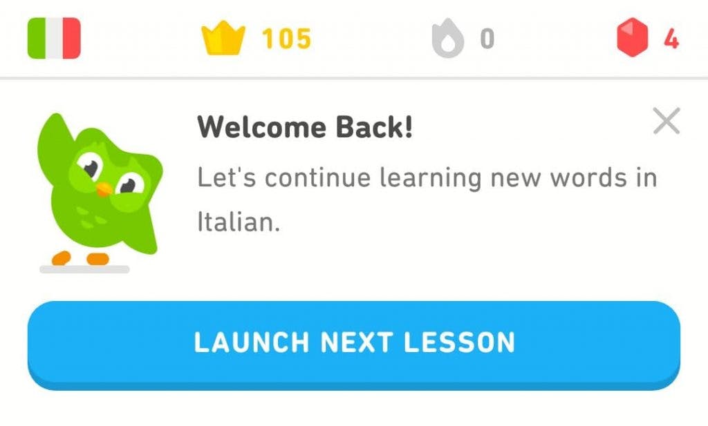
All I had to do was click this, and it transported me to where I'd left off. For someone like me who's quite far down the syllabus and doesn't always use Duolingo step-by-step but rather goes back and forth between lessons, this functionality was fantastically helpful.
Yet another technique Duolingo uses to reduce scrolling-time for the impatient user is the dumbbell icon nestled in the bottom-right corner of the home syllabus screen.
Eliminating the need to scroll or use a menu, this takes you straight to a random lesson to help sharpen your skills. Of course, the lesson may not always coincide with what you want to focus on, but that's not necessarily bad. It's just an alternative way to use the app that I really appreciate.
During lessons, Duo the owl will pop up now and then with an 'I'm proud of you!' or '6 in a row - well done!' Especially for learners who are easily discouraged, this feature can work wonders to ensure continued engagement.
And so it seems Duolingo can do no wrong. But if we want to nit-pick, where does Duo have room to improve?
Duolingo Moving Forward
I'll be honest - it's hard to think of ways to improve something already so intuitive. And outwith its core functionality, Duolingo seems to have mastered the art of non-invasive push notifications to encourage it's users to return, which is a difficult feat on its own.
As someone who's dedicated a lot of time to using this app over the years, I've only seen it function better and better. That is as an app, mind you. Whether Duolingo has found the right language-teaching methods is a debate for another time. And Duolingo would certainly benefit from making room for users to interact with each other through the app.
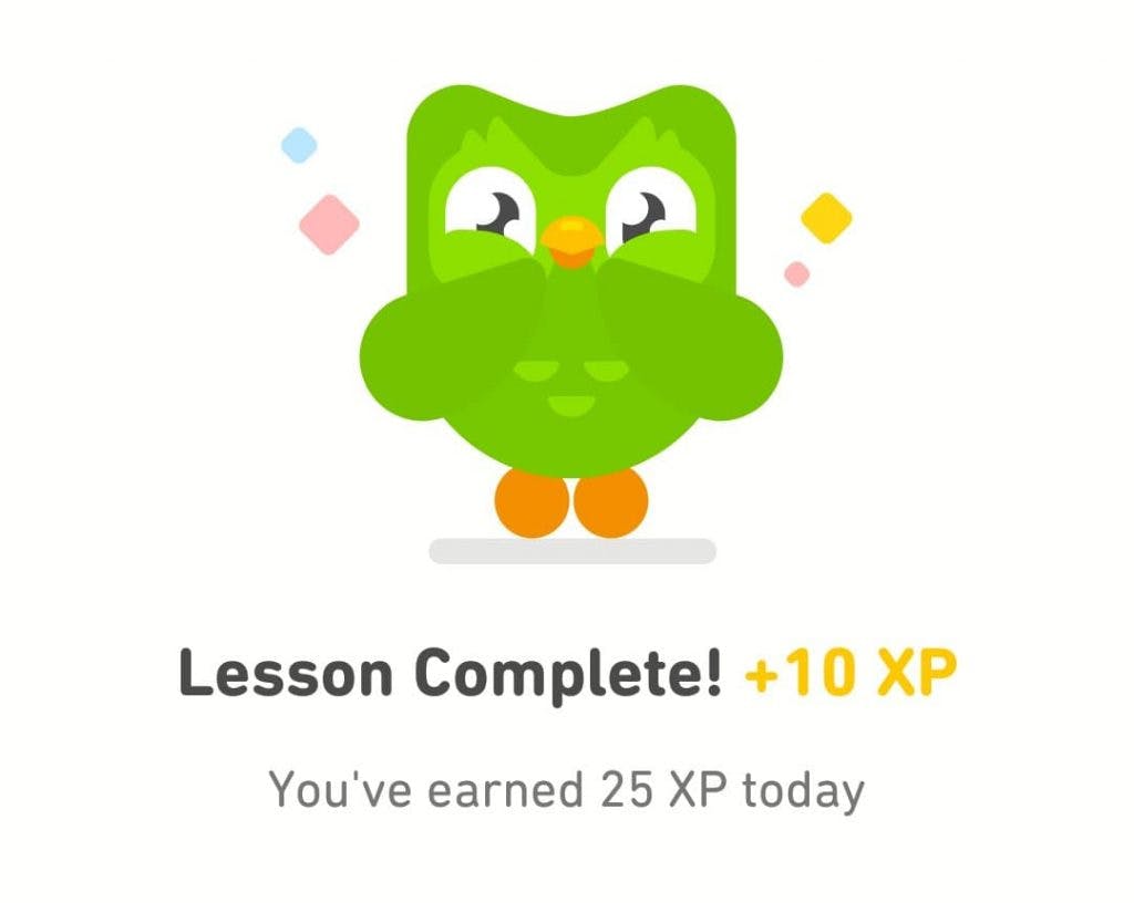
If you pushed me to point out some UX in need of improvement, it would probably be the process of exiting a completed lesson. It's not bad, and it looks good, but it feels a tad excessive. In total, three to five clicks are required on the free version of the app.
- You click 'continue' after the final question. Duolingo congratulates you for completing the lesson and tells you how much XP you've earned, plus your daily total XP.
- Duolingo tells you your 'combo bonus' (extra XP) and updated total XP.
- If you've earned a 'lingot', you're informed of this and asked if you'd like to 'double your reward'.
- You're told [if you've reached your daily XP goal] that you've continued your daily streak.
- You're brought to an ad you must close at the top left of the screen.
Even in the paid app, two obligatory clicks feel excessive. Why not simply count the total XP from the lesson and combo bonuses on one screen, with some sort of animated breakdown including any lingots earned? That owl is cute though.
Duolingo's characteristically slick minimalism and well executed text hierarchy.
Need We Look For Problems?
It could be argued of course that these extra clicks help keep the user focused after the payoff of completing a lesson. And the same could be said about the scrolling action.
I talked with a designer recently who pointed out the obligatory scrolling as a flaw and it gave me pause for thought. You have to scroll downwards through the lessons to find the one you're after. And naturally this process takes longer depending on how many lessons you've done.
Importantly though, I've never seen an actual Duolingo user complain about this. In theory, the scrolling might sound mundane, but it's part of what people like about the app. It gives the user a chance to flick by already unlocked lessons and maybe end up practicing something they hadn't thought of. It's also satisfying to see all the progress you've done as the lesson icons change colour over time.
It'll be interesting to see if Duolingo ever does explore alternatives to the vertical scrolling as the sole search functionality. Such a move would have to be excellently handled, though. From a design perspective, one should be careful not to assume something is already perfect. But honestly, after a decade Duo may have cracked it. Thankfully, Duolingo has a good reputation for responding to and acting upon consumer feedback, so I'm sure if future updates contained any blinding UX blunders, they'd be fixed. And if they continue this way, they'll grow exponentially, and continue doing good work in making language-learning accessible for all.