'The Basics of Typography' - a 10 minute gem from Maxime Rabot
Visual Designer Maxime Rabot has created a fantastic Figma Community resource in his quick and accessible guide to basic typography and why it matters. As typography for beginners resources go, it's well worth your time.

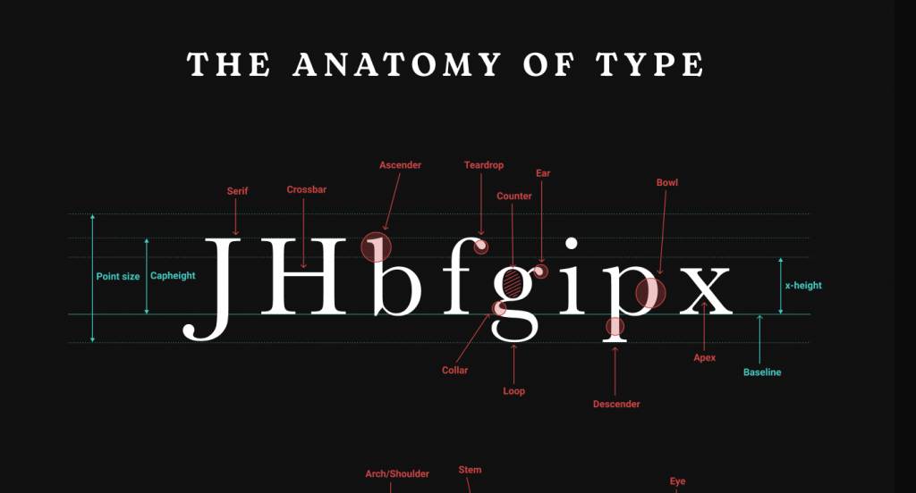
A snippet of a handy infographic in 'The Basics of Typography'
A joy to read
First things first, 'The Basics of Typography' is one of the most appealing and legible resources I've seen on this topic. (No big surprise as Maxime Rabot is an accomplished designer). And this is part of what makes its utility as a learning tool so striking.
I read this entire guide in 10 minutes - while eating my lunch - and enjoyed every moment. A lot of the vocabulary is foreign for those unversed in typography jargon, and yet it never feels overwhelming.
The first page alone goes over several central principles - with easy to understand examples - as well as some invaluable tips and tricks. The text is punctuated by some beautiful illustrations and highlighted with attention grabbing use of contrast in font weight and size.
The star font throughout the guide itself is Bogart by ZETAFONTS, which is round and friendly yet strangely elegant. In fact, Rabot makes it look so good, that I looked into downloading it right after!
From the bigger picture to bitesize basics
After a beautiful 'Anatomy of Type' infographic, displaying some essential vocab in context, you reach the 'Classification' page. This breaks down different styles of fonts one by one in just enough detail.
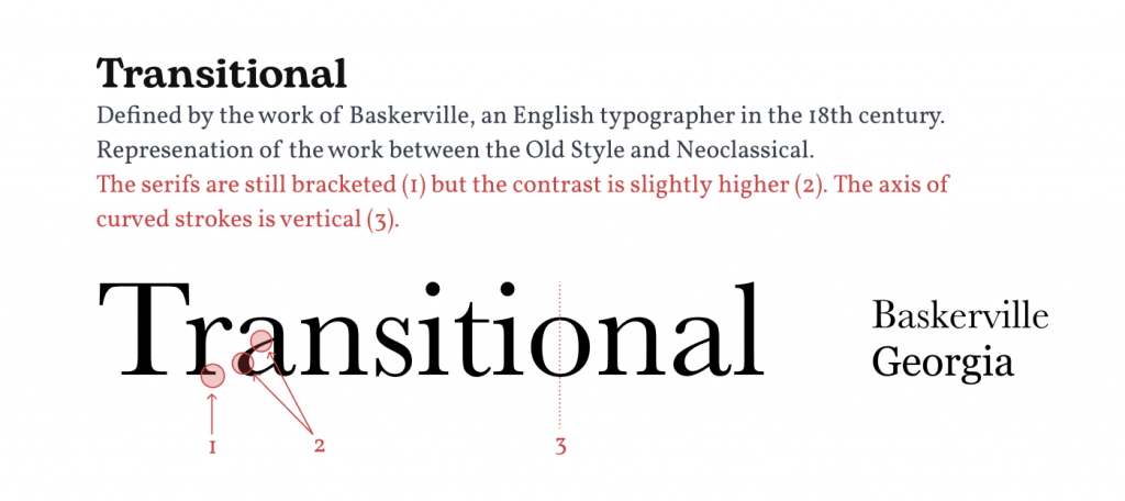
Among the example fonts here, everyone is guaranteed to recognise at least a few. What makes this page so useful though is how the details in the characters are put under a microscope and briefly explained.

Neatly colour coded and unobtrusive arrows, circles and lines delineate parts of the letters we need to pay attention to. It's the kind of visual learning that anyone interested in design is sure to benefit from.
This super informative yet quick to read page goes through the main serif and non serif styles chronologically. Thus, Rabot gives us a look into the fascinating story of typography history, leaving us wanting to go do some Googling and learn more.
The lesser used but nonetheless interesting 'Experimental Styles' of typography are not yet explored on this page. But Rabot's 'Coming soon...' message on this subject is promising.
In fact, this guide will probably continue to grow for the foreseeable future, so if you want the quick 10 minute experience, check it out now!
No excuses
If you're looking for a free typography for beginners guide or have any interest at all in the subject, go read 'The Basics of Typography' right now. It's the kind of resource that takes no effort to consume and only leaves you inspired to learn more. So go on. What's ten minutes?
