The do's and dont's of Skeleton Loading in React
Skeleton Loading is the practice of displaying a mockup of a a part of your interface while data that is supposed to fill that interface is loaded. In theory this is no different than showing the user a spinning icon or telling them that you're loading something, but there is research that suggests skeleton loading tricks users into thinking your app loads faster than it does.

Beyond that, it's an excellent way to avoid parts of your interface shifting as data loads in and overall makes an interface look and feel more polished.
How to implement Skeleton Loading in React
If you're looking to implement Skeleton Loading in React, I'd recommend using an external dependency. Depending on the behaviour you want it might get quite complex so you'll probably not want to handle that complexity yourself.
That said, there are two specific packages I recommend if you need to develop a Skeleton Loading functionality:
- Skeleton React, which uses an interesting approach which consists of re-creating your skeleton with SVGs.
- React Loading Skeleton, which simply displays a skeleton of X and Y size as a DOM element.
The way I like to use Skeletons is to have a Skeleton version of each component I'm planning to display once the data has been loaded. So for example, if I have a page that allows me to search for articles I would most likely have:
- A skeleton for article cards
- A skeleton for the search bar
- A skeleton for all the different categories the user can filter between
These would be replaced by both their non-skeleton components the first time my data loads. You could also have a single skeleton for all the components above, but in my personal experience breaking each down to its most basic components allows for more reusability and less work.
If you had to load more articles on another page formatted differently from this search page, you'd be able to reuse the skeleton component for just the articles rather than having to re-create a skeleton specifically for that page!
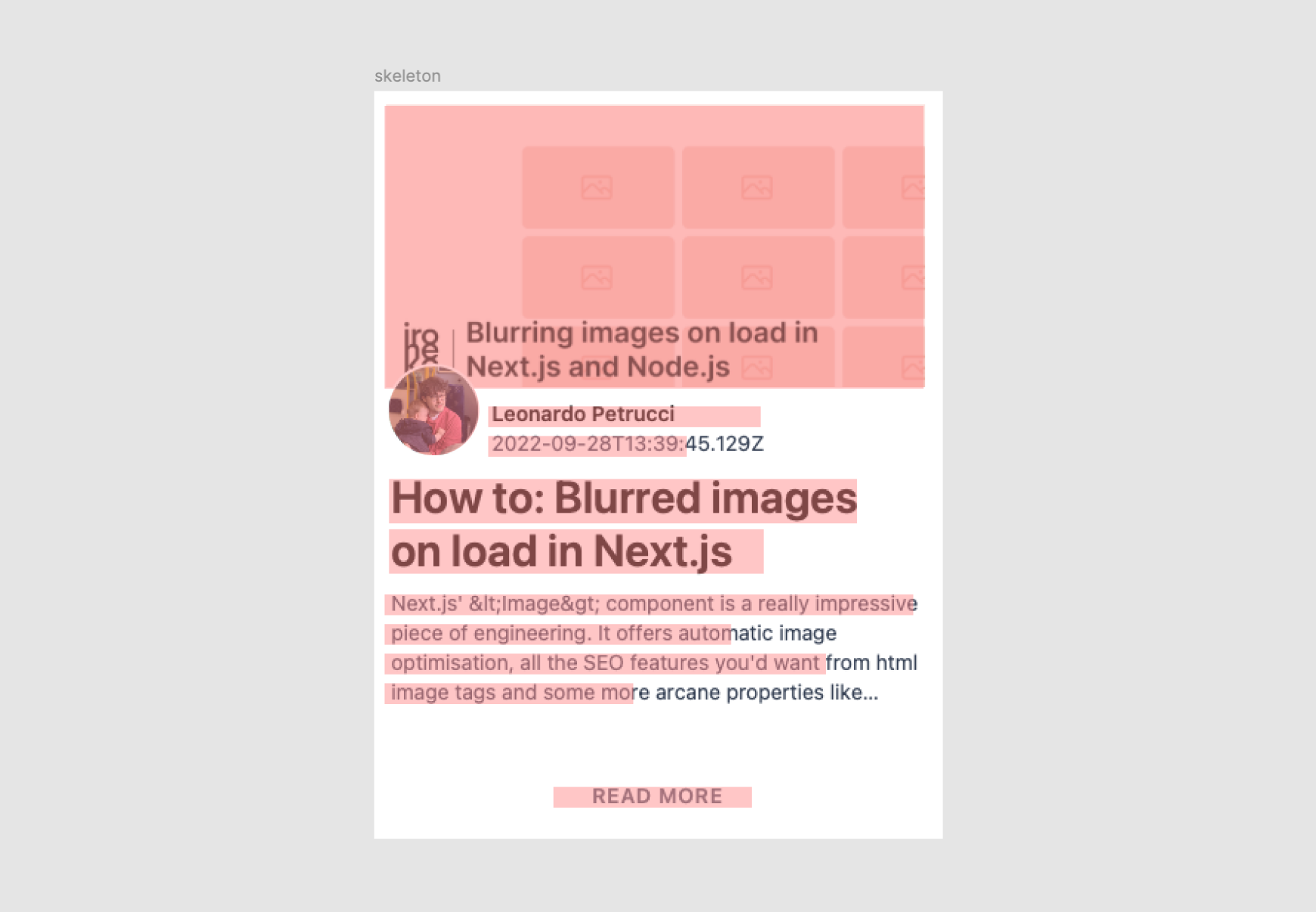
The example above uses the same components I use for this blog and allows you to trigger between the two different packages I mentioned above.
Differences between the skeleton packages and how to use them
The example uses both react-content-loader as well as react-loading-skeleton. If you switch between them you'll notice that there's not a huge difference between them visually. However, they are created in very different ways.
React Loading Skeleton
This is probably my favourite out of the two, mostly due to its ease of implementation. Since the package simply exports a DOM element we can just copy our existing markup (styles and all) and simply replace its text with a skeleton!
Aside from that, it's also quite easy to change its styles so you'll most likely be able to make it look any way you want without much hassle.
- Quick and easy to create skeletons
- Easy to style and customise
- Responsive by design
- Probably not great for accessibility since it will be interpreted as a DOM element
- Lots of code duplication to match the component's styles
React Content Loader
React Content Loader is definitely a bit more complicated to use than its DOM counterpart, but it does have its advantages. My main complaint about this package is that creating a skeleton is difficult. You're unlikely to know how to position SVG elements without a visual aid so you won't be able to create a skeleton just with code.
My preferred way around that is to take a screenshot of whatever I want to transform into a skeleton, open it in Figma and replace the elements I want to make into skeletons:
Each red element is an SVG rectangle. You can then:
- Select the frame containing your rectangles
- Go to "Export" in the right sidebar
- Select "SVG" and then export
This will download an SVG file which once dragged into any code editor will reveal the SVG you need for your skeleton component! For example, the above ended up being:
<svg width="388" height="504" viewBox="0 0 388 504" fill="none" xmlns="http://www.w3.org/2000/svg">
  <rect width="388" height="504" fill="white"/>
  <rect x="13" y="10" width="364" height="191" fill="#D9D9D9"/>
  <circle cx="43.5" cy="216.5" r="30.5" fill="#D9D9D9"/>
  <rect x="13" y="340" width="357" height="14" fill="#D9D9D9"/>
  <rect x="13" y="360" width="234" height="14" fill="#D9D9D9"/>
  <rect x="13" y="380" width="298" height="14" fill="#D9D9D9"/>
  <rect x="13" y="400" width="168" height="14" fill="#D9D9D9"/>
  <rect x="127" y="471" width="134" height="14" fill="#D9D9D9"/>
  <rect x="83" y="233" width="134" height="14" fill="#D9D9D9"/>
  <rect x="83" y="213" width="184" height="14" fill="#D9D9D9"/>
  <rect x="16" y="264" width="316" height="30" fill="#D9D9D9"/>
  <rect x="16" y="298" width="253" height="30" fill="#D9D9D9"/>
</svg>
We can then clean it up a bit (remove fills, borders, add some corner radius) and place it in react-content-loader's component:
  <ContentLoader
    speed={2}
    // We want our component to be vaguely responsive
    width="100%"
    // unfortunately the height needs to be hardcoded
    height={500}
    backgroundColor="#f3f3f3"
    foregroundColor="#ecebeb"
  >
    <rect x="13" y="10" width="364" height="191" rx="3" />
    <circle cx="43.5" cy="216.5" r="30.5" rx="3" />
    <rect x="13" y="340" width="357" height="14" rx="3" />
    <rect x="13" y="360" width="234" height="14" rx="3" />
    <rect x="13" y="380" width="298" height="14" rx="3" />
    <rect x="13" y="400" width="168" height="14" rx="3" />
    <rect x="127" y="471" width="134" height="14" rx="3" />
    <rect x="83" y="233" width="134" height="14" rx="3" />
    <rect x="83" y="213" width="184" height="14" rx="3" />
    <rect x="13" y="264" width="316" height="30" rx="3" />
    <rect x="13" y="298" width="253" height="30" rx="3" />
  </ContentLoader>
It's likely you'll have to change your height/width depending on the situation, but that's pretty much all you need.
- Essentially just displays an image, which is great for accessibility
- Code is clean and short
- Difficult to write without visual aid
Tips on creating your skeleton components
Here are a couple of things I highly recommend you do when writing your skeleton components in React. They'll make the whole thing much easier to manage.
Keep your skeletons with your components
One of my favorite ways of keeping my code organised is to keep each component's skeleton in the same file as its main component and then export it using dot-notation.
// inside components/mycomponent.tsx

import SkeletonPrimitive from "react-loading-skeleton";

const Component = () => {
  return <></>
}

const Skeleton = () => {
  return <SkeletonPrimitive />
}

Component.Skeleton = Skeleton;

export Component;

// in another file

import { Component } from 'components/mycomponent';

const MyPage = ({ isLoading }) => {
  return (
    <>
      {
        isLoading ? <Component.Skeleton /> : <Component />
      }
    </>
  )
}
Keep sizes consistent
Since loading skeletons largely work to replace missing text it's very important to make sure different levels of typography are consistently replaced throughout your skeletons. For example, if your body text is always the same size and always has the same line height, so should any skeleton that replaces body text.
Not everything needs to be put into your skeleton
It's easy to just replace all the elements in a div with skeletons and call it a day, but sometimes keeping it simple will actually make it look far more professional.

For example, the skeleton from the example above is missing the author's photo which would've been overlaid over the skeleton of the article's thumbnail. In general I think having skeletons crossing over each other doesn't look great so I decided not to include the author's picture at all.
Make it look good!
Let's be honest, the main reason you're wanting to implement skeleton loading in React is to make your app look more professional or make it seem faster. So the best tip I can give is to just keep trying until it looks good!
Both react-spring and framer-motion are great options to animate the transition between your skeleton and your actual component to give it that extra polished touch.