Gamification, Gambling and Groceries: how ASDA Rewards makes spending fun
In 2022, gamification played an increasingly major role in supermarket rewards apps as financial savviness became more important than ever. Apps like ASDA Rewards and My Morrisons began outshining more traditional loyalty schemes by offering a more dynamic, user-driven experience. In short, they tapped into our human desire for fun.
Instead of just tallying points, these apps hook us by gamifying and expanding the rewards process in increasingly clever (and even addictive) ways. But how?
What is Gamification?
Gamification is when a process or system is modified to mimic the dopamine-driven experience of playing a game. This allows a designer to ensure engagement by turning the mundane or difficult into something fun.
Duolingo, which uses rewards and checkpoints to make language learning addictive, is a great example.
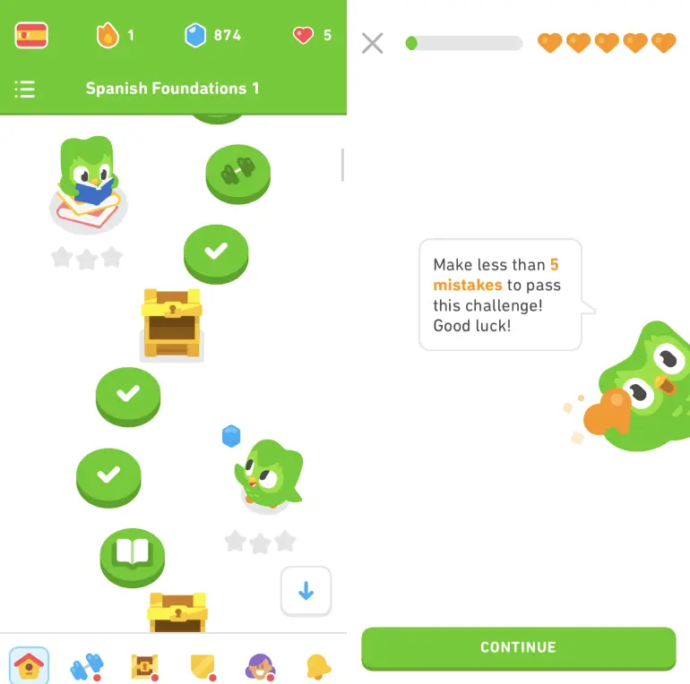
The app even has a “health” system, whereby the user loses hearts if they make a mistake. These hearts, cleverly reminiscent of classic videogames, work exceptionally well with Duolingo’s simple, child-friendly aesthetic.
While it might be harder to spot gamification in supermarket apps, the technique has become a primary method of keeping customers hooked between shopping trips.
ASDA Rewards, one of the newest faces on the rewards app market, is a great example.
ASDA Rewards
Everyone's a winner, baby
When you open ASDA Rewards between shops, you’re instantly hit with a congratulatory message about your “cashpot”. This clever wording, synonymous with casinos and prize draws, excites the user.
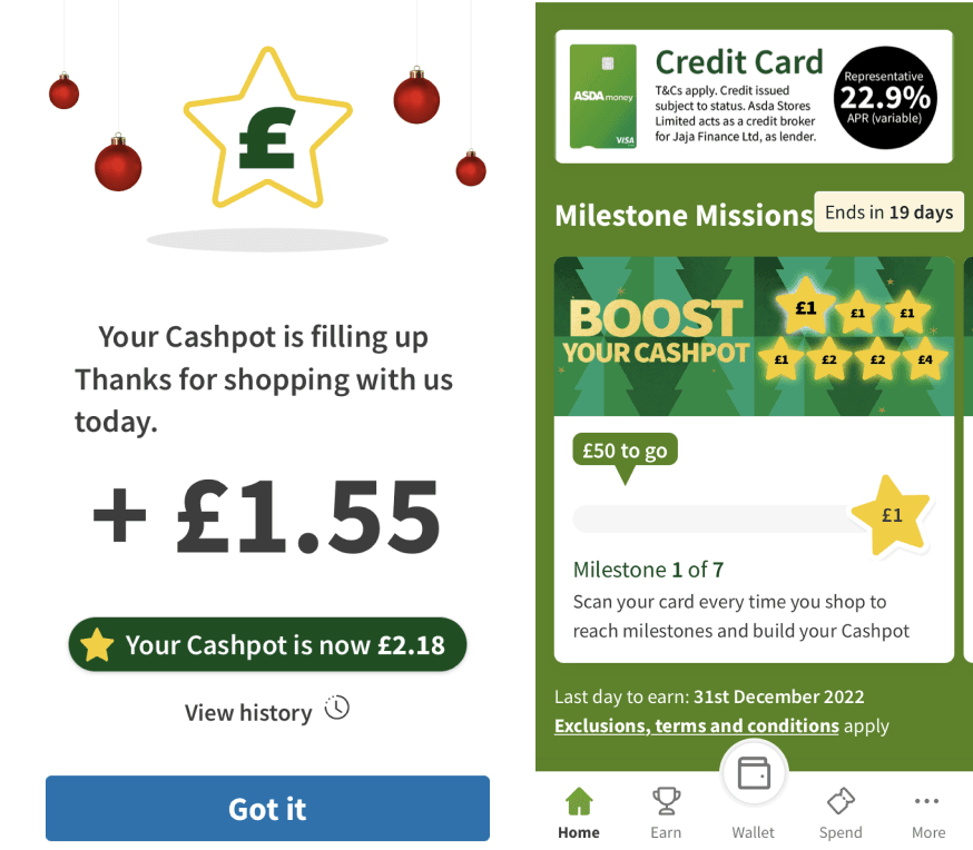
Is it manipulative? Yes kind of. As in reality, you haven’t really “won” anything - you’ve spent a lot of money and got a little bit of money in return. But thanks to gamified language, the illusion of success is there.
ASDA Rewards uses gamified language and gamified design hand in hand really well here, accompanying their popup with some fun and celebratory star imagery.
The homepage is adorned with even more stars, a further mention of your cashpot and a menu at the bottom with some interesting icons. What really stands out under close inspection is the icon for ‘Earn’. Rather than a star, a tick or a pound sign, ASDA uses a trophy, thus reinforcing the all important idea of “winning”.
Moreover, the icon for ‘Spend’ resembles a ticket. The kind of ticket one might use at a casino in an amusement park...
Abundance-suggestive design
Indeed, the idea of gambling is everywhere, implicitly woven into the visual langauge of the app. Like a casino, ASDA Rewards strives to create a sense of abundance.
As you scroll you're met with card after card, some packed into carousels and some with star-spangled checkpoints. Everywhere you look there is some new way to earn.
Remember, gambling and gaming are very similar. Both rely on hooking the user with the fun of a tantalisingly intermittent dopamine rush.
Progress Bars
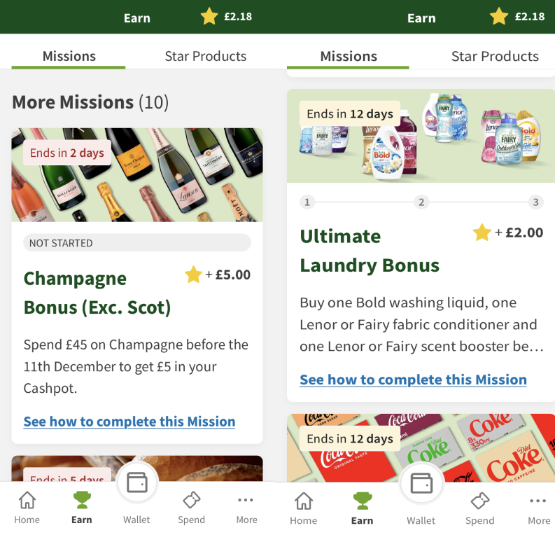
As gamified design hallmarks go, checkpoints and progress bars are pretty easy to spot. And ASDA wields these to full effect.
In the ‘Earn’ section of the app you’ll find tasks to complete in store. This can be as simple as spending a certain amount on a certain type of product like champagne or fruit and veg, or take the form of a 3-step challenge of buying specific products within a certain timeframe.
To make the most out of this functionality, the user must check the 'Earn' tab in their downtime. You can plan your weekly shop at home, for example, around these challenges while aiming to hit as many 'star products' as possible.
Challenging the user
By adding these extra steps and thus complicating the shopping process, ASDA Rewards gives the user the illusion of having significant agency over how much they can "win" in the battle between their desire to save and the shop's desire for profit.
Not to mention that tasks are fun. This is why missions, checkpoints and fetch quests are so commonly used in videogames.
Utilising gamified language, ASDA even calls their tasks ‘Missions’. And watching your green progress bar fill up as you complete them is pretty satisfying, even if the “prize” for completion is nothing more than a measly £1 for your cashpot.
'Mission milestones' build on this concept. You get bigger and bigger prizes from these for completing certain missions consistently over time. This instills a feeling of having achieved something significant, even if all you've done is… go shopping.
My Morrisons
Festive Challenges
This Christmas, Morrisons’ slimline but competent rewards app utilised progress bars very cleverly indeed, challenging customers to spend £20 each week in the leadup to Christmas. In exchange, a "free" £8.
Like mission milestones in a game, each week is marked as “completed” with a green tick. Humans love completing things, so seeing all those ticks in a row gives an all important sense of achievement and satisfaction.
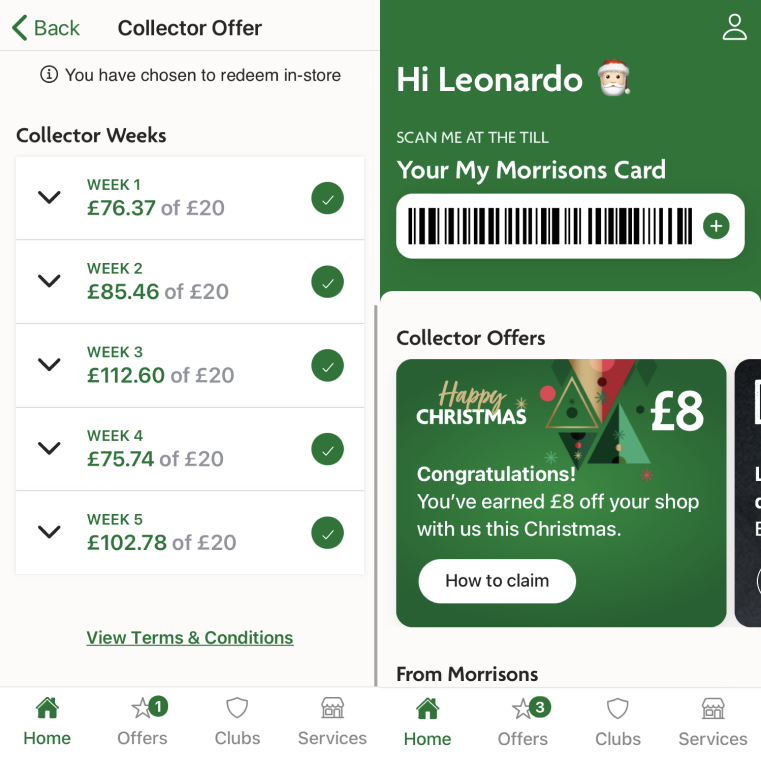
It could be argued that Christmas spending targets are problematic. During a time of financial hardship, it seems a bit insidious to force £20 out of someone who’s spent £18 and doesn’t want to spend any more. Especially when all they're promised in return is less than a tenner weeks down the line.
Either way, it's certainly clever.
My Morrisons has ‘clubs’ too, indicated by a little shield icon like that of Duolingo’s 'leagues'. Their 'Christmas Savers’ club is part of this but its benefits aren't clearly stated.
Basket Bonus
Morrisons’ “basket bonus”, while underexplained in the app, is a great piece of gamification. Essentially, it promises that you ‘could unlock an offer’ when scanning the app at the till, like a random drop in a videogame.
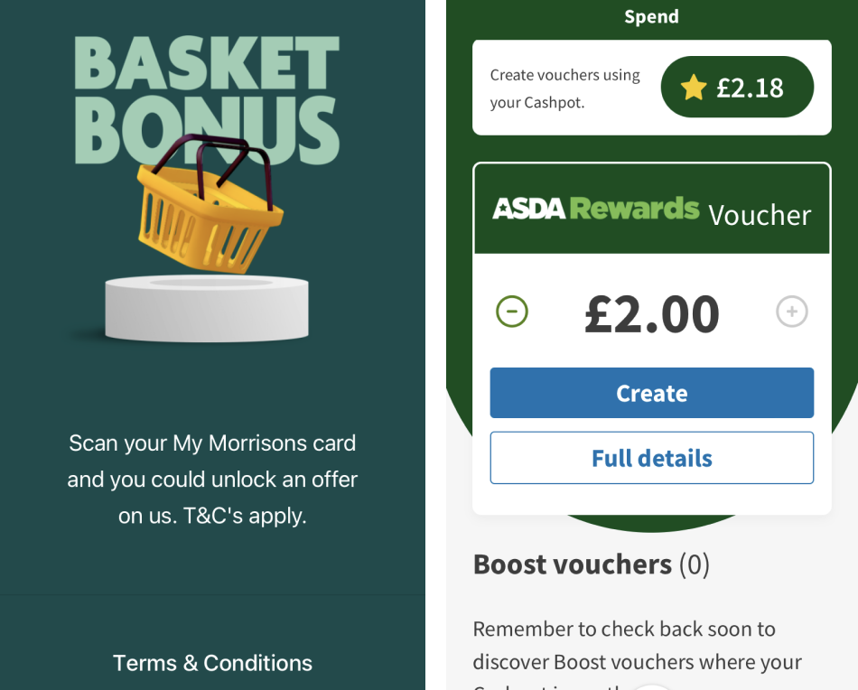
I have personally been blessed with a basket bonus once, and only once. However, I have to say it was genuinely exciting. It appeared out of the blue when I scanned my card, with a slider and a command to swipe right to unlock my mystery offer.
My special item was just £1 off my shop, but I felt like I was winning. I had gained and the supermarket had lost! Which in reality is not what happened, but it left me wanting more, which is what a successfully gamified rewards app does.
I particularly like how the slider gives a momentary feeling of agency. Or more agency, at least, than one gets from clicking a button. Maximising user agency is an excellent tactic, also used in ASDA’s voucher creation feature which allows the user to decide when, and how much, to cash out.
Lidl Plus
A half-baked attempt
Lidl Plus is a much more paired down attempt at a dynamic loyalty experience. However, here at least, simpler doesn't mean better.
The app focuses mostly on regular coupons which are activated and used passively like Boots Club Card coupons. I have a feeling this functionality may be phased out as the years progress as it simply doesn’t have that addictive quality.
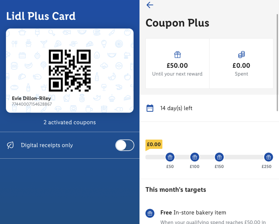
In the Coupon Plus section, users are given ‘rewards’ for spending certain amounts, visualised as checkpoints on a progress bar. The checkpoints are decorated with undersized present icons and the page is starkly devoid of colour. I can't see myself wanting to interact with the app between shops.
All in all, it lacks the gamified flair of ASDA Rewards or the bold typographic hierarchy of Morrisons More.
(Not to mention that users are urged to spend up to £250 a month to earn a gift as measly as a 10% discount. Ouch.)
Lidl Plus has one pretty cool gamified feature up its sleeve, however.
Dailies
This Christmas, Lidl created an advent calendar with mystery daily surprises. And this is where the app’s gamification really shines.
Upon opening the app, you’re prompted to ‘tap for today’s treat’ as a cursor icon hovers over an illustration of a present. The hand cursor as a nod to PC gaming is a fun touch. An animation shows the present opening and your ‘festive surprise’ appears... (20% off a cake, for example).
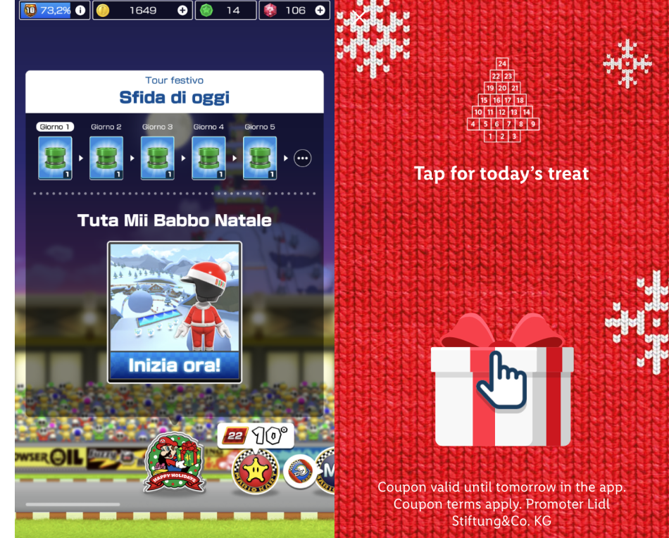
Again, the prizes aren’t much to write home about but their importance is glorified by the interactive, gamified design and word choice.
Seeing your prizes visualised in a progressive grid mimics the experience of “dailies”. In mobile gaming, these are daily challenges with specific rewards.
Mario Kart Tour’s daily challenges are a good example of this. The more consecutive days you interact on, the more rewards you get. By using the same technique, Lidl Plus encourages users to keep interacting with their app even when they’re not visiting in store or actively purchasing anything.
Is ASDA Rewards the start of something bigger?
As the rewards app gamification trend continues, many more brands are likely to follow suit if they want to keep up.
Boots Club Card has historically provided one of the best - if not the best - points systems in retail, but they’re stuck on a coupon activation system which doesn’t encourage user interaction in any fun or meaningful way.
Would it be off-brand for Boots to encourage users to start opening their app every day to complete challenges, or follow progress bars? Maybe. But what's for sure is that modern consumers demand a richer experience than one akin to scanning a card at a till.
And with mobile phones now an inextricable part of life, techniques born from mobile gaming or social media are naturally successful in ensuring user engagement.
The age of rewards cards is coming to an end, and the age of interactive rewards experiencesis well and truly here - even if that means more room for user manipulation.
