The Woes of Bad Period Tracker Apps (& How iOS Solves Them)
People will put up with all manner of design sins when settling for a period tracker. And it wasn't until I tried Apple's in-built cycle-tracker that I realised just how dire the situation on the app store was. So whats the big deal?
The Importance of a Good Mobile Period Tracker
Every friend and family member I know who menstruates uses a period-tracking app. And unless they're into tech, they generally settle on the first or second thing they find in the app store. This is... fine... But we deserve better. So why don't we hold period apps to a higher standard?
The main problem is that these apps become such a part of one's daily life, it's easy to get used to inconvenient UX and shoddy design just because it's familiar.
I too have been guilty of this. Simply due to its many options for inputting symptoms, I once settled on 'Period Tracker by GP Apps' for a month, despite a wince-inducing colour scheme and one of the dullest calendar-layouts imaginable.
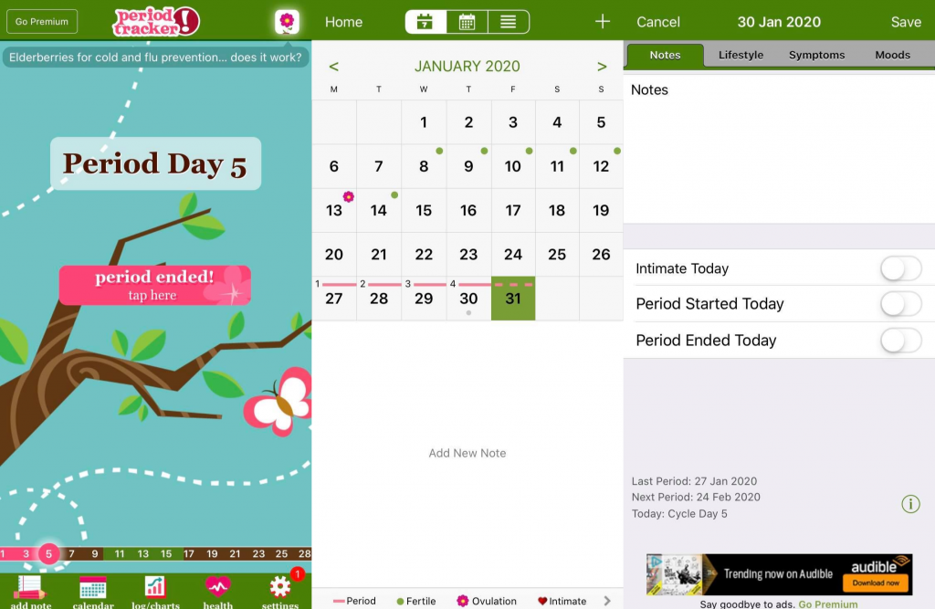
In hindsight, their text hierarchy was all over the place too, but I didn't notice. After all, it's just for tracking my periods right? (as well as my fertility, sexual activity, mental health and general well-being...)
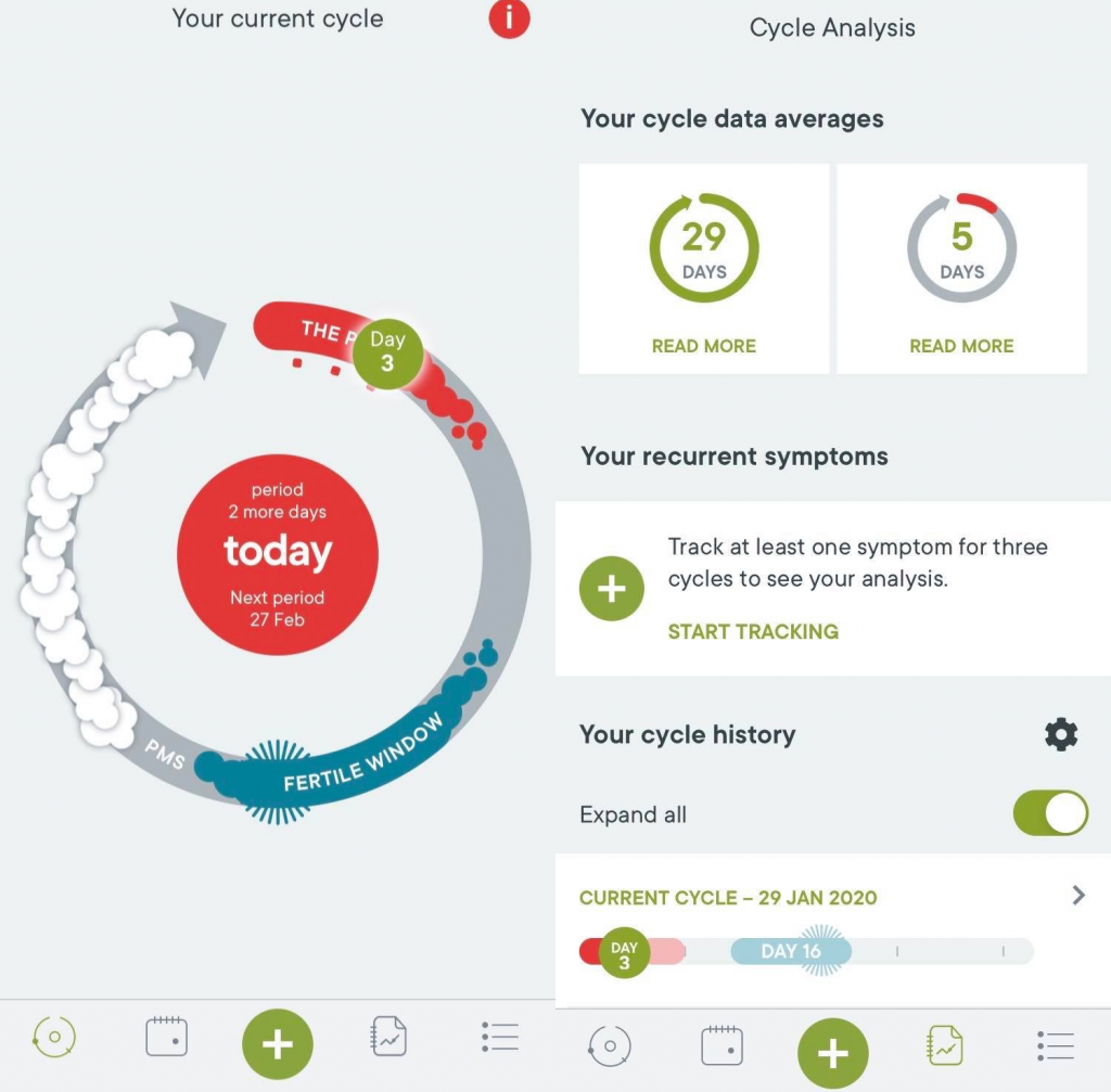
Eventually, I realised the app's transgressions and found 'Clue', which had fun and thought-out UX in a very simple yet pleasant colour scheme. I'd definitely recommend it as the most modern choice in the Play Store. Crucially, 'Clue' uses a circle-calendar rather than the traditional calendar layout, which is fantastic for visualising your cycle in its entirety.
Suddenly, entering my menstrual and sexual data went from something mundane to something I enjoyed.
So What's Trendy in Period-Tracking App Design? (Spoiler: it's bad)
The many options (which I'll give credit to for at least being free) usually sport a garish pink colour scheme, which is cute at best and nauseating at worst, and a lot of flower imagery. There's no escaping the pink and petals, in fact, as you scroll down the app store.
Two of the worst offenders here are 'Period Tracker Period Calendar' (yes, really), which makes you choose, or even pay for, a pet animal to watch over your cycle. And the dubiously named 'Best Menstrual Period Tracker' deserves a mention for, among other sins, claiming to know if you'll conceive a girl or a boy...
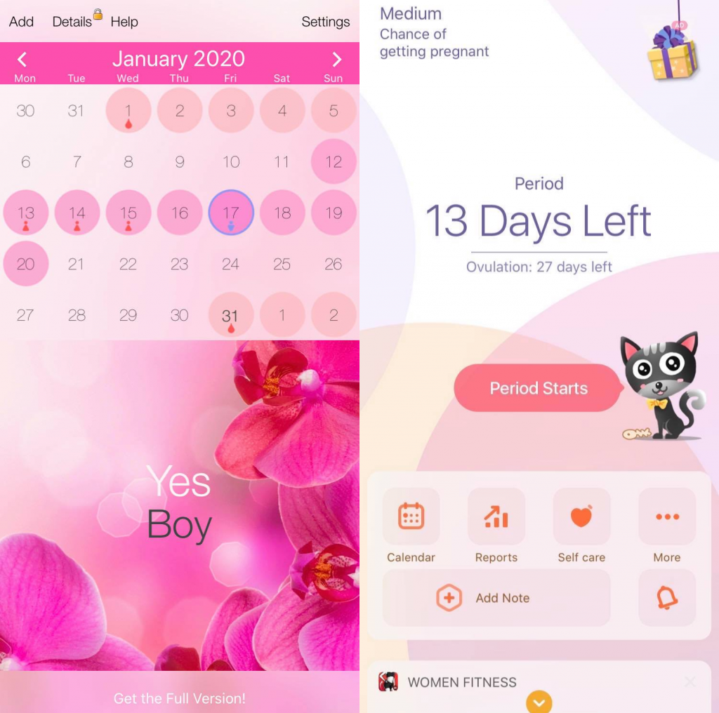
Both of these apps sport the ubiquitous flower icon and hide the word 'period' from your app-drawer like it's a state secret.
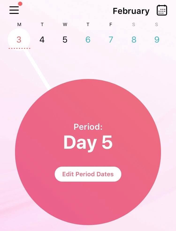
One I'd seen a few friends rave about is 'Flo', an intriguing choice due to its 'community' element, with articles and forum-like features. However, again, the colour-scheme is predictable and the home-page is plastered with a huge pink circle representing 'today'. It's not awful, but it's a clear effort to simply fill up the screen.
A white line connects the circle to the date at the top of the screen. iOS uses a similar 7-day calendar but unlike iOS (where the dates move forward so that 'today' is always centred), 'Flow' keeps the calendar static so that 'today' is only centred once a week.
It's... odd. So I stuck with 'Clue', sure that it was the best option. That is until I got an iPhone, and scrapped period-tracking apps entirely.
How Period-Tracking With iOS Breaks The Mold
Many period tracker app developers will try to dazzle you with as many options and features as possible (usually causing a bit of a mess). So your first encounter with iOS' cycle tracking might feel a little sparse. However, it's not lacking - it's just been optimised.
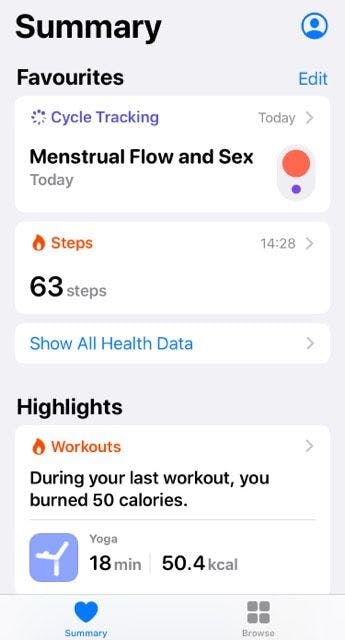
As soon as you open the 'Health' app, 'Menstrual Flow' is your focal point at the top of the screen. Cleverly it's been placed to stand out against, while being integrated with, the rest of your data.
Thus from one square in a menu where no space is wasted, you can see:
- The last time you updated your data (mine simply says 'today' twice as I used the app today)
- A visual representation of what you've inputted (red signifying menstruation, and purple signifying sexual activity)
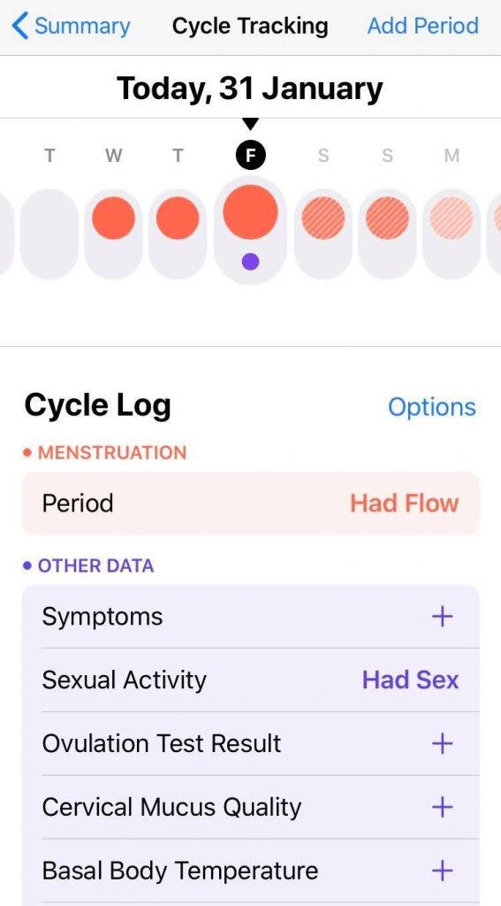
If you're looking for more info, simply click on this summary and you're brought to a simplified one-week calendar. Again, it uses the clearly coded colours of orange and purple. Being complimentary yet softened, these shades harmonise nicely with each other in a way that creates contrast without dominating the screen too harshly.
Apple-Sleek Data Management
Below your one-week summary, there are options to add other data such as sleep changes, mucus state, mood, cramps, and even body-temperature. Most of these are hidden in a sleek, infinite carousel menu that opens when you click 'symptoms', minimising clutter on the main page.
Notice here that Apple have used pastel shades to background their boxes and occasionally coloured text in deeper versions of the same shades.
This economic use of colour creates a modern feel that most period apps miss out on.
And lower down still on the main menu, you can find the traditional full calendar layout. This is great if you're only accustomed to seeing your data this way after using other apps. I end up using the calendar very little, actually, considering that most period apps have it as a main feature.
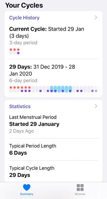
I find the 'Your Cycles' section much more interesting. From there, I can see a visual representation of my cycle history as well as statistics about how my typical cycle plays out. This section plays with the data in ways that are much more space-friendly and digestible than a calendar.
Problem Solved?
Not everyone you ask will be as dissatisfied with the current period tracker market as me. As I said, even if the app your using is cluttered and clunky, you might not even notice. But good design exists for good reasons! One of them being to make the mundane tasks in life more pleasant.
So if you own an iPhone and want a smoother, more aesthetically pleasing way to manage your menstrual data, give iOS' in-built feature a shot. You'll be surprised at how satisfying it is seeing all your health data in one place, rather than having your period info hidden away behind a magenta flower icon.
And if you're not on iOS, I'd highly recommend 'Clue' as a strong contender. While it can't integrate all of your health info, there's enough allowance for you to manually input symptoms, and everything in 'Clue' just makes visual sense. Which is always nice. Let's hope other apps take a hint from their design team and take the period app market to the level it deserves.