Unordered lists with icons: A Better Solution
Much of front-end design is simply finding interesting ways to display elements. One element type that requires particular care with regards to this is the unordered list. Sadly though, as you probably know, unordered lists are rarely pretty.
They're a great way to display quick information, don't get me wrong. Visually, however, they're generally terrible.
- This works perfectly well
- You can clearly read my points
- But it's kind of bland
How do I make my lists more interesting?
Here's a simple solution: images. By just changing those bland black dots to an image, a difference is immediately noticeable. The information is instantly more fun to read, and it easily catches the reader's attention against the uniform text around it.
How do I do it?
As usual there are a few options to get around this issue with varying success. Let's go through them.
The :before solution
This is likely the first solution you will stumble upon while googling.
.element ul {
  list-style: none;
}

.element li:before {
  content: "";
  display: inline-block;
  height: 1.25em;
  width: 1.25em;
  vertical-align: middle;
  background-image: url(custom-icon.svg);
  background-size: contain;
  background-repeat: no-repeat;
  margin-right: 0.5em;
}
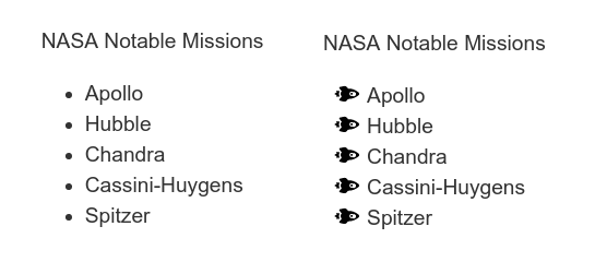
It's simple, and it's effective. Unfortunately though, I found out the hard way that it's not perfect in every case. After implementing it for an advertisement, my list ended up looking like this:
With this trick the list stops behaving like normal. If text goes over a single line, the list will stop working as intended and look messy. It can still be useful if you need a quick fix, but it's not very professional.
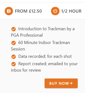
The list-style-image solution
If you scroll down a little more through your Google results, you will find this guide by Mozilla. The result is essentially the same:
But it does fix the annoying problem we had before.
This is a great solution. It doesn't require any "hacks", it's easy and can be implemented with a single line of code.
list-style-image: url("../../media/examples/rocket.svg");
It's good but we can do better.
The flexbox solution
This is by far my favorite solution simply because of the _flex_ibility it offers. In my specific case I was required to have control over a few things that the previous options did not have:
- Use different icons for each bullet point
- Easily change their color
- Easily change their size
- Have the icon centered vertically with the list item
We can do all of these thanks to this flexbox hack. Here I'm using ionicons for my image, but you could easily use an img tag with an SVG instead.
<ul>
  <li>
    <span><ion-icon name="checkmark-circle" role="img" class="md hydrated" aria-label="checkmark circle"></ion-icon></span>
    <span>Your item</span>
  </li>
</ul>
ul {
  list-style: none;
  padding-left: 0;
}

li {
  margin-bottom: 0.5rem;
  display: flex;
  align-items: center; // This centers the icon vertically
}

li span {
  display: flex; // This aligns the icon with the text
}

li ion-icon {
  margin-right: 0.75rem;
  font-size: 1.5rem; // Thanks to ionicons I can change the size of the icon! woah!
  color: #e57421; // I can even change the color!
}
And here' the result:
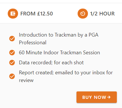
Beautiful, isn't it. What makes this solution so much better than the others is the ability to add icons directly in the HTML, as dealing with changing single files in a wall of CSS can be very time consuming.
Immediately, the information is clearer to read, more aesthetically pleasing, and more inviting. It looks like someone took their time over it. The overall effect is more expensive, for want of a better word, which is especially useful when you're trying to encourage customers to buy a product or service.
Conclusion
Ultimately, as a front-end designer, your most important task is to make information look interesting. In 2019 you shouldn't be using a web 1.0 solution to create a page that needs to sell something, especially when it comes to elements as ubiquitous as unordered lists.
Taking your time to do something more like what I've suggested above will draw the user in and make them want to know more about your product. And you might even find yourself having fun with unordered lists in a way you didn't think was possible.
Give it a shot, you won't be disappointed.