Modern Branding Done Right: a look at Octopus Energy
From their signature colour scheme to their email domain, Octopus Energy's modern branding never fails to come across as effortlessly cool and novel. Here's why...
What had to change? Stagnation in Energy Brand Design
Founded in 2015, Octopus Energy is younger than 5 of the "Big Six" energy providers in the UK. This is probably why their site is completely devoid of hackneyed early 2000s design trends.
But what is it that makes the Big Six feel so tired in comparison?
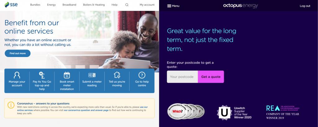
Prioritising high contrast over familiarity, Octopus' site sports a dark blue background with magenta highlights. This approach is far removed from how every single one of the Big Six supports their utilitarian aesthetic with a white background.
Pasty colour schemes won't intimidate your gran, but they're not exactly exciting. And it makes a lot of these companies hard to tell apart.
whose idea was this? Ants aside, the word 'us' is barely legible against the image
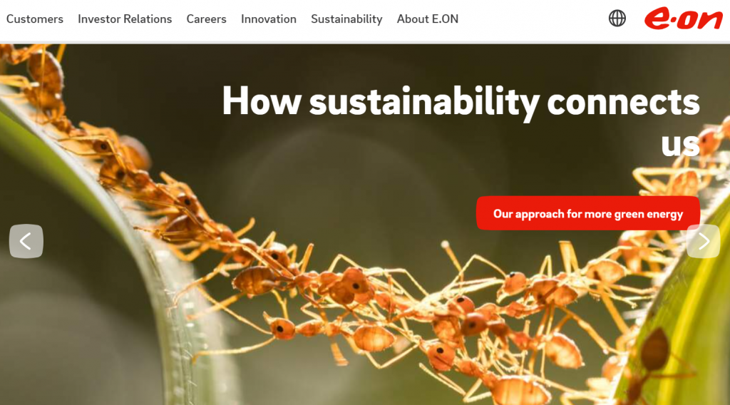
Unsurprisingly, the Big Six are also fond of slapping photos of people and nature on their homepages in an attempt to connote larger concepts like togetherness, eco-consciousness or family. Yawn.
(Eon for one currently uses a closeup image of ants - their translucent bodies all crawling together between two blades of grass - which is just... confusing.)
But the modern consumer has learned already that a happy family or a tree doesn't make a brand more trustworthy. In fact, these tactics - used even by Npower (founded in 2016) - are considered old hat at best and manipulative at worst.
What Makes Octopus Energy's Site Feel So Fresh?
Daring to be bold
Octopus Energy stands out for completely doing away with traditional colour schemes and (even more impressively) photos of any kind. This is because they know the modern consumer doesn't need to be patronised.
The oft-used green and blue colour coding (which has come to be associated with "clean energy") is nowhere to be found. A bold move considering that 100% renewable electricity is one of Octopus' main selling points.
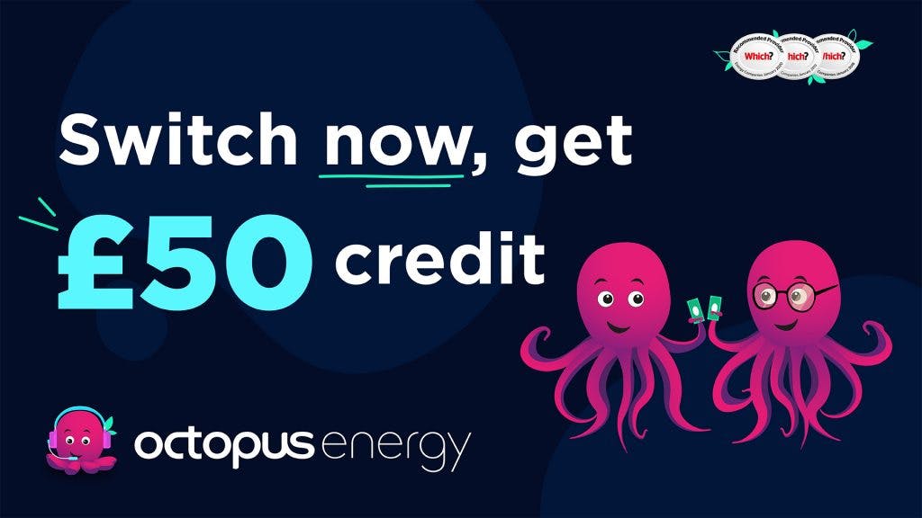
Everything about the electric pink and blue interfaces here command your attention without once holding your hand and explicitly saying trust us.
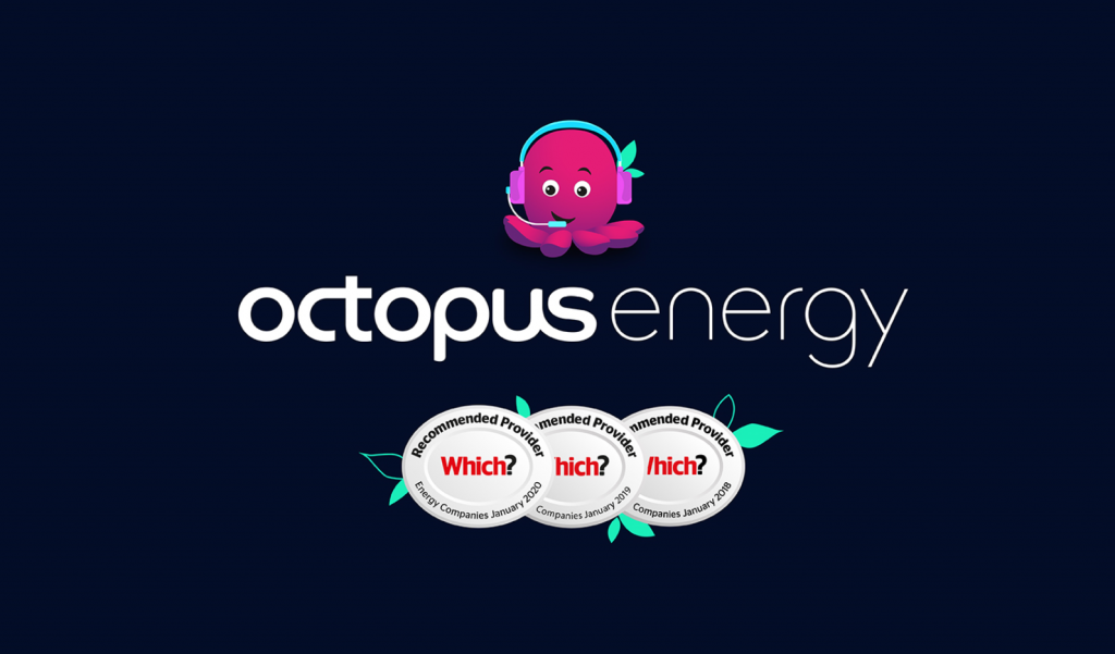
Their simple, smiling Octopus mascot - the only animal mascot in the industry as far as we've seen - does a great job on its own of endearing the user.
What does an octopus have to do with gas and electric? Nothing. And that doesn't matter. What matters is that it's cute, novel and easily turned into a recognisable favicon in your tabs. That is modern branding sensibility.
Unlike a dog, which might connote loyalty, or an owl, which might suggest, research and reliability, an octopus doesn't mean much. But it doesn't have to.
Keeping things simple
Furthermore, Octopus Energy benefits from modern design knowhow in that it does all it can to save you from reading, or even seeing, info you don't need.
The top left corner of energy supplier sites usually houses a logo to bring you back to the homepage. But with Octopus, this corner instead hides a hamburger menu with four slickly animated main options.
Having this menu in place of a logo completely eliminates the need for the bunch of jumbled links and contact info usually thrown at the bottom of legacy company site pages.
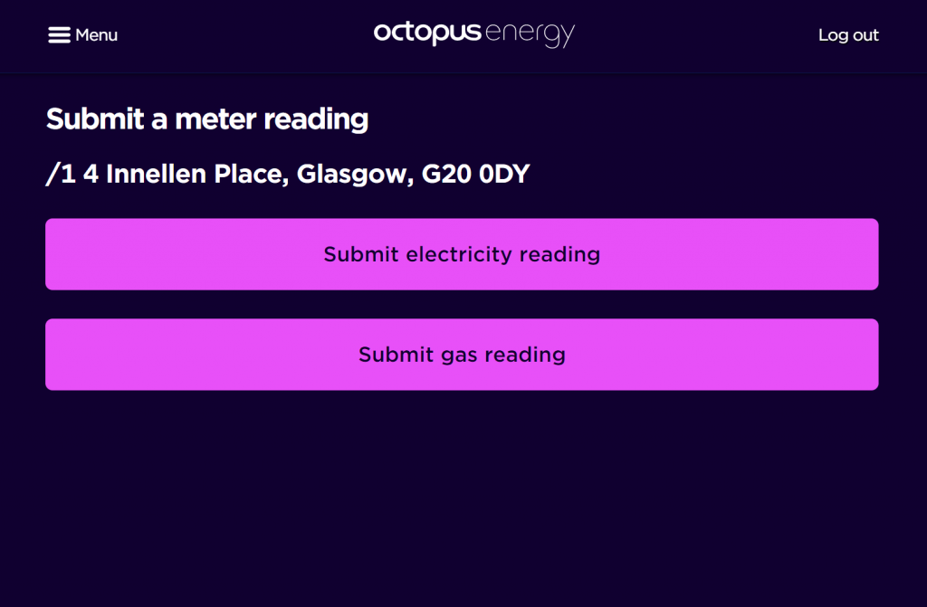
Notice also how huge and unmissable the buttons are. This might only save you a second or two time-wise, but it makes the overall experience feel so much easier and catered to your needs.
Their site is never text heavy and you can do almost anything you'd want to in one or two clicks. This all fits really well with their philosophy of transparency, which doesn't have to be spoon-fed to you to be evident.
UI That Knows its User
Slick UI is key to modern branding success. And right from the off, Octopus Energy have it down pat.
When you first visit an energy supplier's site, you want to know one thing: how much is this going to cost me if I sign up? Knowing this, Octopus Energy plaster a huge pink 'Get a quote' button as their focal point.
Less than 5 minutes passed between me clicking that button and getting my quote. And I was even greeted by a cute animated octopus while the quote was being calculated.
In contrast, SSE gives the vaguer option of 'Find out more', which means... well, nothing. And the button just hangs there limply in a crowded page where everything seems to fight equally poorly for your attention.
Sure enough, upon clicking SSE's 'Find out more', you're brought to a page with 12 more options and asked if you have an account yet.
How Octopus Energy Gets Emails Right
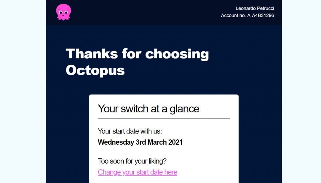
Sporting the same colour scheme as their site, Octopus Energy's correspondences look starkly different to all your other emails. Not to mention the cute icon at the top left there. Isn't he sweet?
Most importantly, a clear font size hierarchy is followed, which means you can skim through their emails and still get all the important info.
We also really love the name of their customer support address: help@octopus.energy. It's trendy, on brand, and easy to remember.
But it's also easy to find.
No more scrawling through forums to find the one person who posted the customer service email, or filling out a form on their website just to contact them. Email contact info is right there on their Ways to Get in Touch page.
Each email from Octopus Energy contains a 'Was This Email Helpful?' feature, which lets the customer give feedback on even the smallest correspondences, making you feel empowered and cared for.
The final verdict
Octopus Energy's modern branding and web design is a testament to the power of simplicity. But it's also a lesson in how important it is to take design risks.
If you're entering a sector where all the big names are already well established, don't do what they're doing. Dare to make visual statements which aren't associated with your industry at all, and you might just end up with something memorable.
What does this mean for the future of energy supplier branding? Well, quite possibly, a lot. With prices between providers not being too different to one another anyway, we might see a move towards people choosing energy providers for the look and feel of their interfaces. For their "coolness".
This could lead to a complete shakeup even for industry leaders whose approach to branding has changed little since the 90s. And that, if you ask us, would be very interesting indeed.