Web Design Inspiration #2: Pulling in clients
The first article in my web design inspiration series explored portfolios and personal sites that struck a perfect balance between functionality and beauty. This week we'll look at web design tricks used by agencies to pull in clients. Not only must these sites be functional - they also have to work as an enticing marketing tool.
PurpleRockScissors
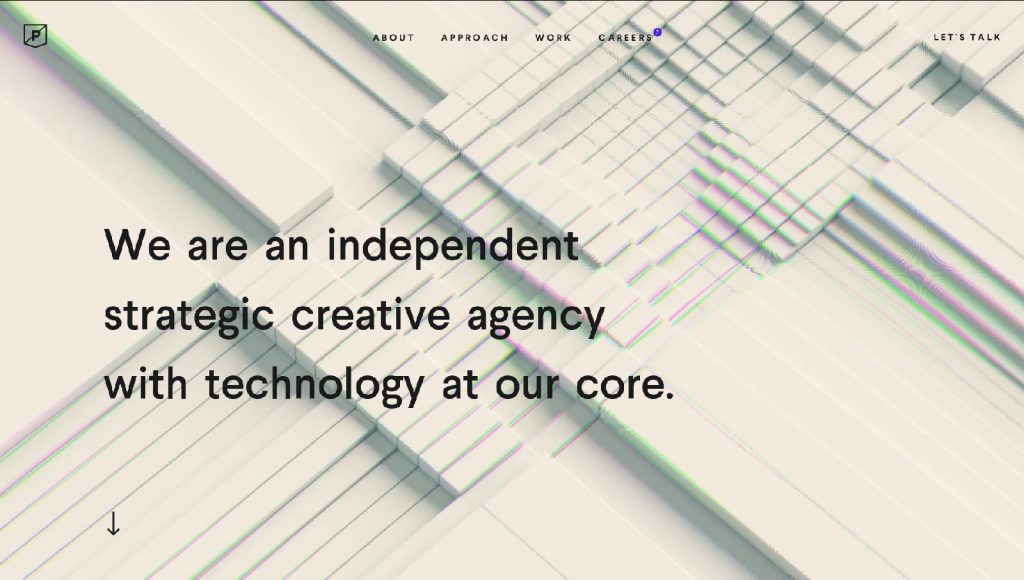
Right off the bat, PurpleRockScissors stands out as a display of technological prowess. A quick scroll through their landing page reveals flashy image animations that respond to mouse position, as well as parallax scrolling and subtle text animations. If you're looking for web design inspiration, this site oozes with it.
There is simply so much going on that your eye wants to linger and figure it out. Some might argue that there's too much going on, but this sense of excess is definitely intentional.
Evidently, this company knows exactly who their clients are - their clients are not designers. And they therefore allow for this by thinking, to a certain extent, like a non-designer. Let me explain. Naturally, the way to get clients from outwith the field to pay for their services is to show them something memorable and flashy that they wouldn't normally see.
After all, to the layman, uniqueness and complexity are usually synonymous with good design.
The information on their landing page is fairly standard. However, the way its presented leaves the user overloaded with visual information, giving an impression of a company overflowing with ideas.
Bebold
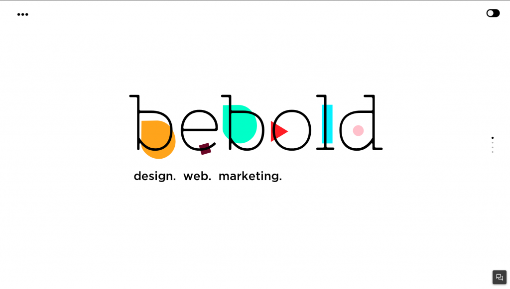
Bebold.ch follows the same basic principles as PurpleRockScissors, but goes above and beyond to set itself apart. Their site is what some would call an "experience", without being excessive in any way.
The combination of animated vectors and simple yet beautiful illustrations come together here to tell a clear story. And clarity is an often overlooked quality to go for when trying to hook clients' interests.
These kind of sites are usually characterised by several non-standard decisions such as: scrolljacking (which is the practice of changing default scrolling behaviour) and mousejacking (which changes the way your mouse works).
The scrolljacking here is particularly impressive. As you scroll up and down, the content doesn't flow past in one continuous movement. Instead, it flicks smoothly from section to section, as if through pages in a book.
This is all supported of course with some lovely animation on almost every element in the page.
I must mention that hijacking practices can be terrible for usability. They're hated in fact by many designers and developers, so much so that mentioning them in most web design communities is an invitation to debate.
Ultimately though, scrolljacking and mousejacking are not always useless. If you want your site to be unique and stand out from the crowd then it's not a bad starting point. Even if a visitor to your site can't tell exactly what's going on, they'll note that the site feels different, and that's something they'll remember.
Manoverboard
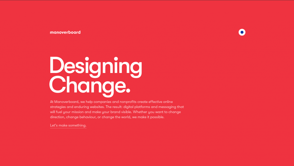
Manoverboard takes everything you know about websites and throws it out the window. And I don't say that lightly, but that's exactly why it perfect if you need design inspiration.
Who would remember yet another site with black text and a white body? A design choice of fools! Knowing this, Manoverboard makes the bold statement of using red and an electric blue as their main colors.
It's not just flashy - it's subversively different.
The most interesting thing about the Manoverboard website is what a non-standard choice of colors allows them to do. They don't need to over-fill their screen with flashy animations and parallax effects, and they don't mess with your scrolling or cursor functionality.
Wherever the site would look empty due to unfilled space, the strong background colours allow it to look interesting and eye-catching.
That's not to say that Manoverboard doesn't use any modern tricks or animations. Their menu button is a subtle but beautiful implementation of the tired hamburger menu.
Overall, Manoverboard's site is a perfect example of how important color and typography can be in making a site memorable. When these elements are coupled with excellent use of empty space, the result is something genuinely unique.
Conclusion
Hopefully this article has underlined how, when designing for an agency with a specific goal, there is no single right route you should take. The secret to attracting people's attention is to play to your strengths, whatever those may be.
Make your site look professional and show your skill in any way you can. The important part is that it has to be visible to your potential clients, even if they can't quite understand all the intricacies under the surface.
I hope this article managed to fill your void for web design inspiration and gave you some ideas. The next part in this series will be out soon, and I have dozens of beautiful sites to share 😉.