An in-depth look into Facebook's new design
After a decade of comfortable design stagnation for the platform, the 2020 Facebook redesign is here. And as one of the lucky people who got to test it this week, and I have to say: I'm impressed.
Facebook has been altering bits and pieces of their design for the past couple of years. However, as these were mostly small improvements on existing elements, they only marginally improved user experience.
So seeing Facebook being re-designed from the ground-up is not only a refreshing surprise, but also something quite necessary.
After all, how many people do you know who claim to have become bored with Facebook, even ditching their account altogether bar the Messenger app?
Exploring Facebook and its new design
There's quite a lot to go through so let's get on it.

The homepage is a breath of fresh air. Every element looks consistent with each other, and there are no more eyesores that look like they shouldn't belong there. All in all, it's clear that a lot of thought has been put into making Facebook's dozens of features work together.

The Facebook homepage design prior to 2020.
In comparison, the old homepage looks cramped and at the same time has too much empty space.
The biggest changes in Facebook's design
There's a lot to go through here, but I'll try to break down the most important improvements that have been made to the interface.
1. Fonts, sizes and color...
In what I suspect is an answer to increasing screen resolutions, the font size within posts has been increased from 14px to .9375rem (15px). This is great, as even with just a pixel of difference, text feels a lot easier to read.
Using rem for font sizes is also new for Facebook as they previously set all their fonts with pixel values.
Font color has also been noticeably changed from #1d2129, which is a very dark blue, to a more standard #050505. This is a running theme with the new design as Facebook slowly moves away from using their traditional, and now somewhat outdated, blue.
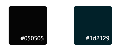
Facebook's new font color on the left, versus the old color on the right
This distancing from the Facebook blue is also mirrored within links, which have gone from #385898 to #050505. These are now distinguishable from regular text just thanks to their weight.
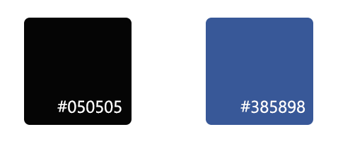
Facebook's new links and their old links
Slight color changes also mean that text contrast has increased from 16 to 20, which is always nice to see.
While the new interface is categorised by more space and bigger elements, line height takes a step in the opposite direction, decreasing from 1.38 to 1.3333. This unfortunately makes paragraphs look a bit more cramped than I would like.
Looking at them side by side it's hard to even notice, but the difference is definitely there
Facebook's font stack has also changed to Segoe UI Historic, Segoe UI, Helvetica, Arial, sans-serif from Helvetica, Arial, sans-serif which will definitely make reading a lot smoother on Windows systems. Arial is now a backup for older systems which don't have Segoe UI, which is fantastic.
2. Borders are out, soft shadows are in
While the old Facebook interface was built around a lot of table-like containers with gray borders, this new version ditches them entirely. This should come to no surprise to anyone familiar with web design as it's been a common trend.
Facebook now sports 8px rounded borders around its posts, and a small 0 1px 2px rgba(0, 0, 0, 0.1) shadow, making it all a bit more easy on the eyes.
The shadow (bottom) is even more noticeable on top of the lighter background.
Following the theme of using space more efficiently, screen post size (on a 1080p screen) went from just 500px to a more comfortable 584px. Paddings on the other hand have stayed largely the same.
Most changes in the way posts are rendered are unnoticeable, such as a dramatic increase in dom elements and complexity to better adapt to the many different types of content available on the site.
4. Buttons are finally consistent
In Facebook's old design I've counted at least 3 different buttons. These buttons use a variety of different font sizes, font families and some even use Facebook's old blue #4267b2 rather than the friendlier #4080ff.

The new Facebook design, once again, makes sure to make their design more consistent.
There are now just two sizes:
- A big button, with 17px text with a height of 40px.
- A smaller one with 15px text and a height of 36px.
Colors are limited to Facebook's blue for important actions, and a safe gray for secondary actions.
Interestingly enough the height of the buttons is absolutely set, with only right and left padding being defined and the text being vertically centred.
4. Streamlined menus
Finally, the top menu has gone through a major overhaul in this redesign.

Here we've one from a staggering 11 links down to just 5 plus 5 navigation links that were previously relegated to the sidebar. This is not a surprise as it largely follows Facebook's mobile app design.
The welcome change here is the complete removal of links such as:
- Home
- Find friends
- Create
- Friend Requests (which are now included in notifications)
- Quick help
- "More"
Which I doubt got much use previously. And so most of these have been streamlined and united under an "account" pop-up.

5. Out of the box dark mode!
No, your eyes aren't deceiving you. Facebook has full support for dark mode. It even asks the user which one they prefer when they switch to the new design, which I appreciated. Here's how the dark mode looks:

I actually wrote about Facebook Messenger's dark mode a couple of months ago, and stated my disappointment that they decided to go with #000 backgrounds as shades of gray would've been a better choice.
That's exactly what Facebook has decided to do for their new interface. Everything is just different shades of gray with not a single black in sight. It's beautiful and my eyes are rejoicing.
6. The chat sidebar finally makes sense
Remember how cramped the chat sidebar used to be? And why were there links to the pages you managed on top of it? No more of that!

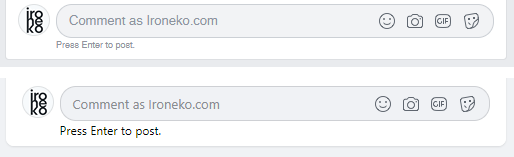
Pages you manage are now moved to a secondary fixed sidebar on the other side of the screen so your chats finally have space to breathe. In addition, fonts here have gone from a squished 12px to a much more natural 15px (like most other text).
Avatars increase from 32x32 to 36x36 while margins between avatar and name increase by a whole third from 8px to 12px.
And in case you hadn't noticed, headings now finally make hierarchical sense. Going from a weird 11px (1px smaller than their section's text) to 17px (1.0625rem).
7. More focus on iconography
Icons have not just been completely redesigned, but are now a lot more prevalent in the design thanks to their size increase.
Previously Facebook's icons didn't go over 20x20 pixels - in Facebook's new design they are all the same size as avatars at 36x36. This helps make the design a lot more coherent and easy on the eyes.
Icons are now also the main source of color as their bright and saturated new designs contrast massively with the largely monochrome interface.
8. Pages reap the benefits of Facebook's new design
There's no two ways about it. Facebook pages were close to unmanageable before. With a series of management links under the header, and then even more on the side, it was very hard to find anything. Pages looked cluttered with too much pointless information.

Consider the screenshot above. This doesn't show almost half of my 1080p screen being completely unused and yet everything was cramped within a surprisingly small container. Check how this is done in the new design:

You'll notice here that a lot of information is entirely gone. At first glance it's hard to tell what's been removed, but most of it used to be in the right sidebar. This includes things such as:
- Suggested groups
- Ratings
- Invite your friends
- General information
- Community
- About
Which have all been condensed into a single About card. I can't even begin to explain how much easier it is to find important information now that it's not spread out over the whole screen. Not to mention, it's now all at the top of the page! Imagine that.
As a page manager, all your settings are condensed within a single sidebar to the left of the screen. The only difference between your view and a visitor is that bar being visible or not.
9. Lightboxes are (kind of) dead
Opening a picture doesn't involve an awkward modal anymore! There's definitely ways to make modals and lightboxes work, but it wasn't what Facebook was doing before.
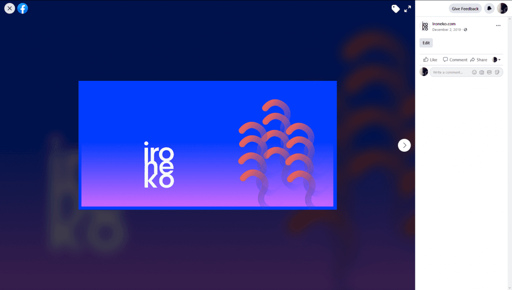
Instead, images now open a full screen view. The functionality is essentially the same, but it makes the interface flow a lot better.
The image is repeated in the background with a filter: blur(2px). If you needed any more proof that the era of Internet Explorer slowing down the web is finished, this should probably be it.
10. Facebook is (almost) mobile friendly
Facebook, as you might have noticed, directs you to a separate interface for mobile.

Even thought that does still happen, the new interface actually automatically resizes depending on screen size.

There's essentially no way to use this outside of your browser's development tools at the moment, but the commitment to creating a such a fluid interface is to be commended.
Weird things with the new design
While my opinion of this redesign is generally favourable, there were a couple of head scratchers here and there.
A whole new tab for "Gaming"
I'm not entirely sure what Facebook's final goal here is, but apparently they made the decision to make their Twitch clone into a primary feature.
The page can now be accessed from the top bar together with important pages such as Home, Videos, Marketplace and Groups.

There's no loading animation
This seems kind of baffling as far as UX goes since it makes using the new interface a bit confusing. In case you weren't aware, Facebook is made with React, which means that its pages don't reload, but rather content gets swapped and replaced depending on what you've requested.
Facebook's old interface works the same exact same way, however the big difference here is the speed at which the requests are handled.
Old Facebook is almost instantaneous in loading requested content, while this new interface is noticeably sluggish. That, coupled with no loading icons means it's hard to understand when content is being loaded.
I'm not too worried about this as it is a beta. So speed will probably be improved later on.
Conclusion
My opinions aside, there are a lot of complaints being directed at Facebook about this new design. A common argument is that it looks too much like Twitter, while others are saying that it's just a mobile design on a desktop interface.
Time will tell on this regard, but for the moment I have to say I simply don't see these things as problems. Twitter looks great, and there's virtually nothing wrong in taking a page out of mobile design to simplify a mess of an interface.
Being such an established platform, every change Facebook makes is scrutinised closely, which maybe explains (though not excuses) their previous inability to move with the times. However, things are looking up for them with this redesign, and maybe (just maybe) they can pull back the younger clientele they started to lose a few years ago.