The One Font Pairing Tool You Need: Why We Love fontjoy.com
Font pairing is a skill almost every kind of designer will have to use at some stage. But a lot of us weren't specifically trained in typography! So where do you start? Thankfully, Jack Qiao's fantastic AI-powered font pairing tool fontjoy.com is a wealth of free inspo for amateurs and professionals alike.

How Do You Use It?
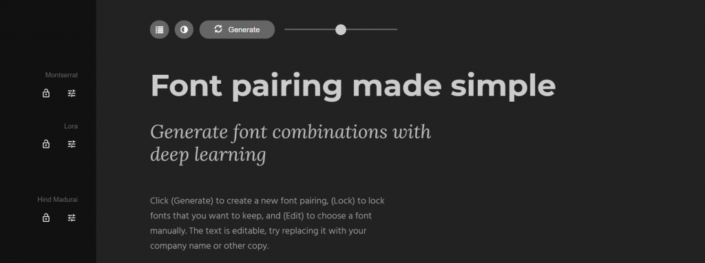
When you enter the site's super optimised homepage you'll see some text laid out in a 3-size hierarchy. This describes the aim and function of the site, but is also your sample text to test out fonts on. A great idea design-wise and a welcome change from lorem ipsum!
You can edit this text any time, and generate new fonts or switch between white-on-black and black-on-white using the buttons above. There's also a slider to alter contrast balance, but it doesn't appear to do much.
What we really love is how you can use the list icon at the top to look through the Top Pairings for your title font. This is a really nice touch that gives you enough extra options without being overwhelming.

If you want to combine more than 3 fonts, you're out of luck. However, for most projects 2 or 3 fonts is more than enough. In fact, using more than 3 is practically asking for a messy-looking project!
And as you generate or manually search for new options, you can use one of the padlock icons to 'lock' that font in place so you don't lose it!
Do Tools Like This Take the Skill Out of Font Pairing?
Short answer? Absolutely not.
A good designer knows that inspiration doesn't just fall into your lap. You need to be actively looking at examples of good (and bad) work to know it when you see it. There are no two ways about it.
Yes, the AI here can point you in the right direction, but the options are still practically limitless. As you lock in fonts you like and generate or search for new ones, you're exercising your critical skills and taste.
This isn't just a font pairing tool, it's a learning opportunity.
Tools like this actually exist for all areas of design. If you work with colours, for example, or need a quick colour palette for a project, you might use a colour selection resource. For some great examples of these, check out this article on how to pick the best website colours.
Fontjoy.com as a Learning Tool
As well as being a learning experience in itself for the user, fontjoy.com shines through with a clear philosophy of transparency on how it was created and a willingness to share knowledge.
On the How it Works page, you'll find a nicely laid out introduction to font pairing, complete with some real-world examples. This is brilliant if you're new to the topic and are interested in the mechanics.

This page also explains how the 3D "map" of fonts was created for the site and how the team's formula systematically searches for similarities between fonts using 'deep learning'.
Want to know more about this kind of AI? I highly suggest you check out the associated Github, which is also linked on their How It Works page, as well as their impressive tensorflow embedding projector.
Our Font Pairing Saviour
The two of us who run ironeko.com appreciate well thought out typography, but it's not our strong suit! So we're permanently bookmarking fontjoy.com for future projects. If you work in design of any kind, you should do the same!
